Rebrand and Packaging Design

StorageBud

Led a full visual rebrand—updating the logo, redesigning packaging, and establishing a cohesive brand identity and direction. This included creating a clean, modern aesthetic that feels fresh, friendly, and easy to understand across both kitchen and home storage lines.

Project & Company Details

StorageBud is a modern storage brand that brings function and style together. They specialize in sleek, space-saving storage solutions—from clear fridge containers and pantry organizers to dinnerware storage, ottomans, and under-sink systems. Their mission is simple: to make organizing your home effortless and beautiful.

The Ask

StorageBud wanted to revitalize their look and feel with a unified brand system that could scale across multiple product categories. They needed packaging that stood out on retail shelves while clearly communicating product use and function.

The Approach

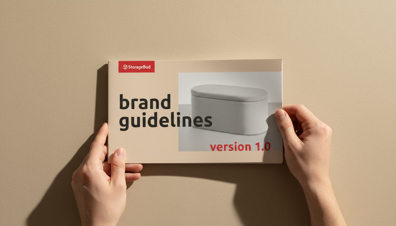
I began by defining a visual identity that balanced utility and warmth—simple enough to convey clarity, yet playful enough to fit the brand name. The logo refresh introduced softer curves and a more approachable font system, while the new color palette and packaging layouts brought consistency across the product line.

Logo Design

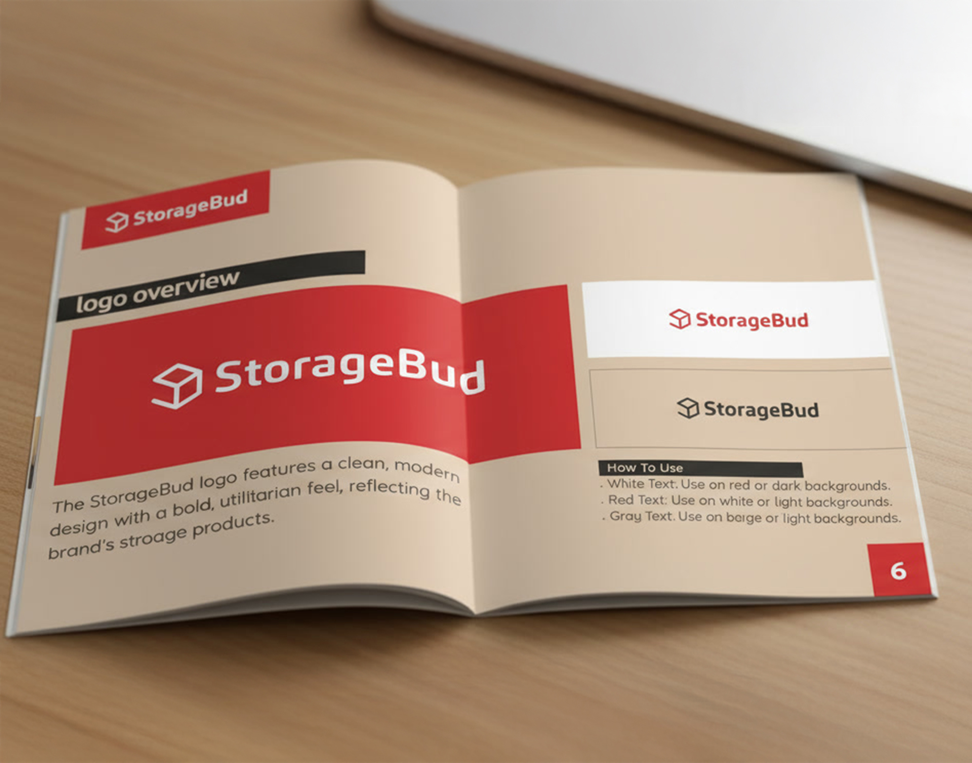
The new StorageBud logo was designed to feel approachable, modern, and adaptable. The rounded lettering and balanced structure evoke friendliness and trust, while maintaining a sense of order and precision that reflects the brand’s purpose.

The redesigned logo introduces a geometric “SB” icon shaped like an isometric box, representing clever, space-efficient design. The soft, rounded typography keeps the tone approachable, while the beige, black and red pairing brings balance and energy.

Packaging Design

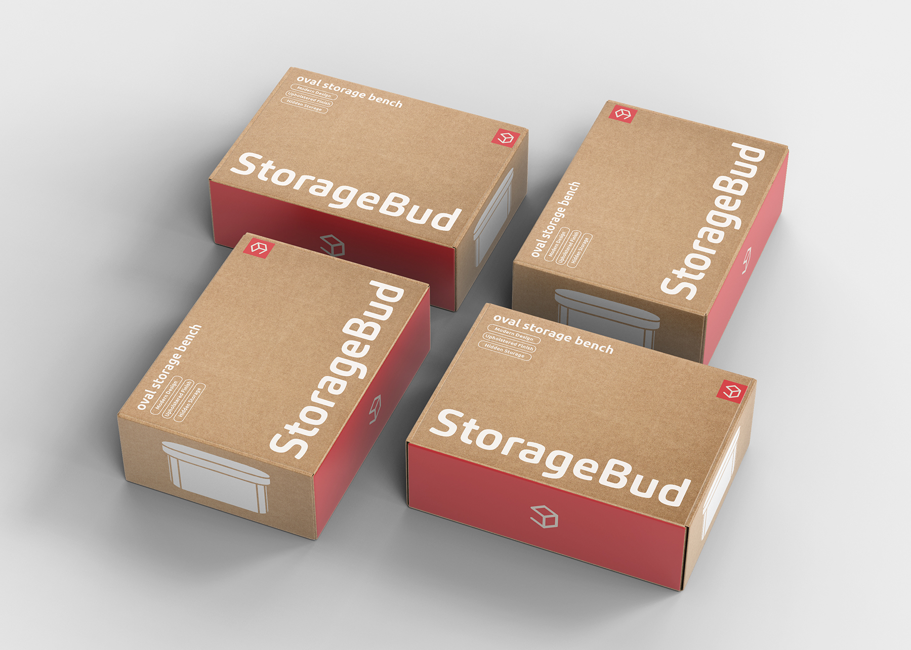
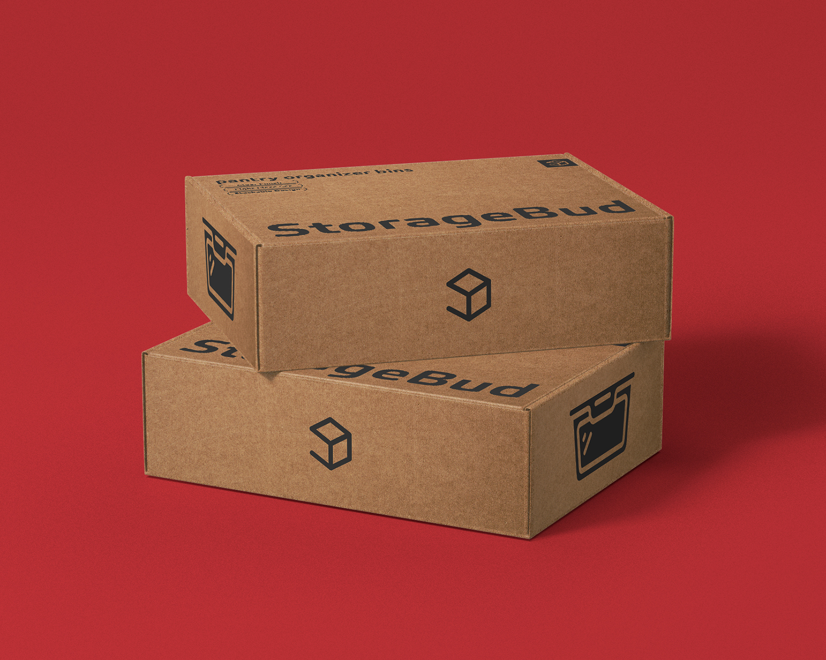
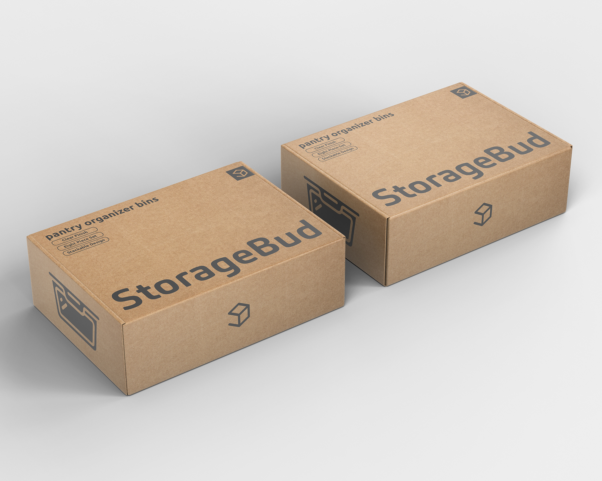
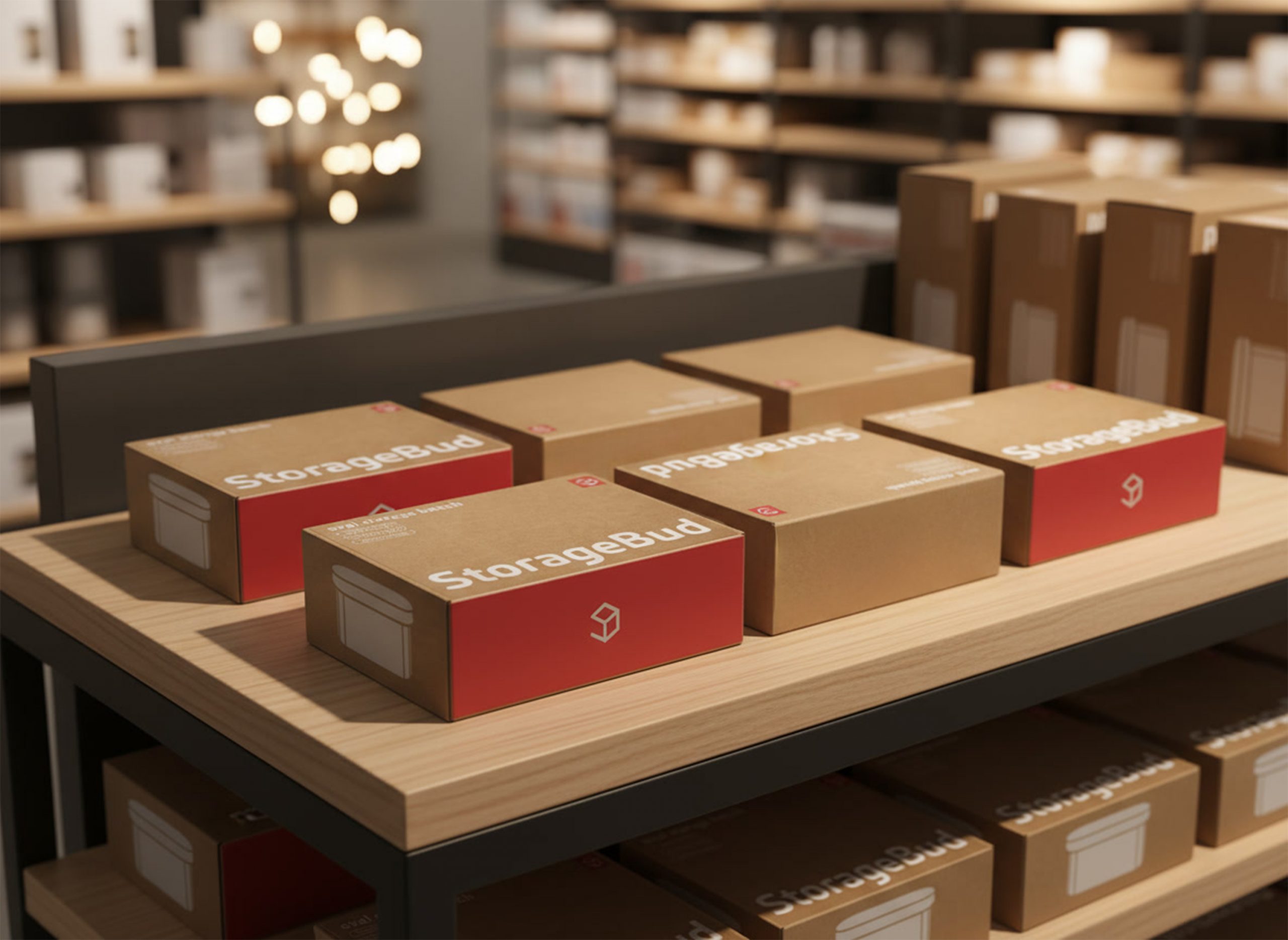
Packaging was rebuilt to communicate clarity, usability, and style. Cardboard backdrops with dark gray or white typography and red accents create contrast and shelf appeal. Each box emphasizes organization, product transparency, and easy comprehension.

Brand Direction & Identity System
StorageBud’s brand identity blends bold colors, large typography, and playful composition to create a look that’s both modern and approachable. Clean black-and-white layouts are energized with strips of vibrant color, duotone filters, and textured overlays, adding depth and personality. Built on a structured grid with intentional element breaks, the system feels organized yet dynamic—perfectly reflecting StorageBud’s balance of function and fun.

Implementation

The new StorageBud identity unites packaging, digital, and marketing under one cohesive look. Clean beige and gray designs with bold red accents and structured typography create strong shelf appeal, while vibrant ads and lifestyle visuals extend the same energy online. The result is a modern, organized, and instantly recognizable brand experience.

Contact Me

Feel free to contact me with any inquiries or questions!