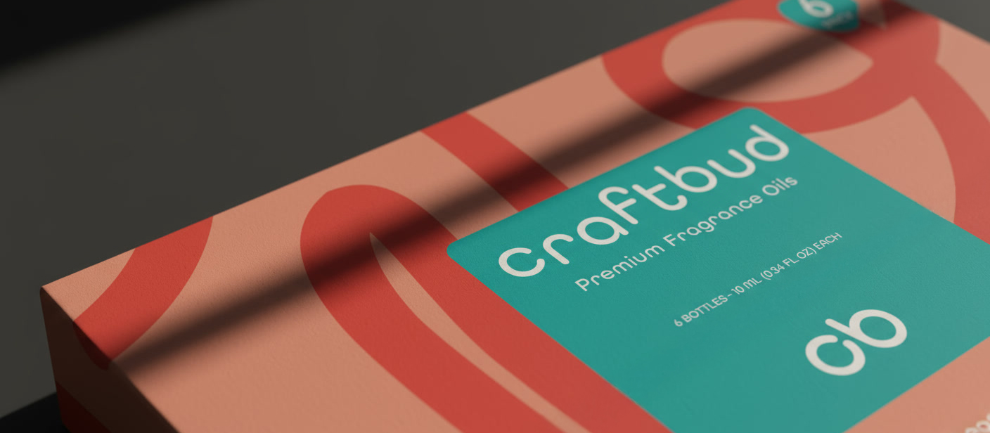
Logo and Packaging Design
CraftBud
Partnered with CraftBud to reinvent their brand identity from the ground up. Designing a new logo, packaging, and visual system that captures the heart of creativity and learning.
Project & Company Details
CraftBud creates fun, creative DIY kits designed to spark imagination in both kids and adults. From candle making to crochet, marbling paint, sewing, slime, and tie-dye, CraftBud’s mission is to make creativity easy, accessible, and inspiring for everyone.
The Ask
The ask was to overhaul the brand’s visual identity to better communicate its educational mission and stand out at retail. The project focused on replacing generic packaging with engaging, child-friendly designs that also signal quality and value to parents.
The Approach
I established a vibrant, flexible brand identity that merges playful energy with an educational structure through bold typography and interactive packaging.
Logo Design
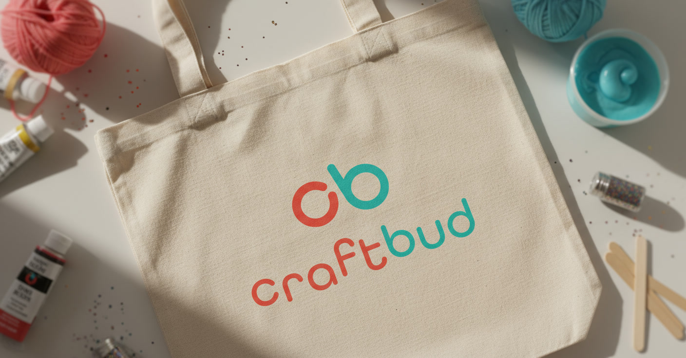
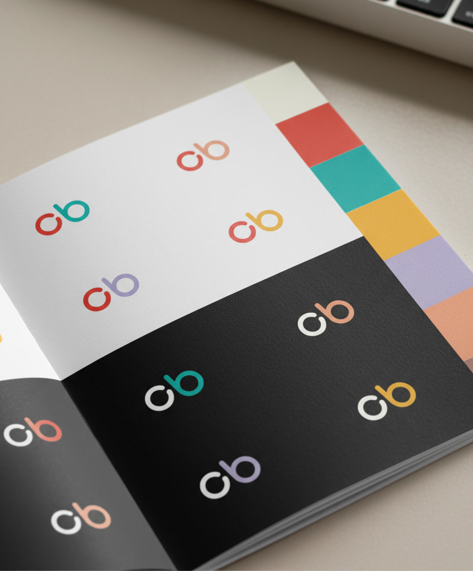
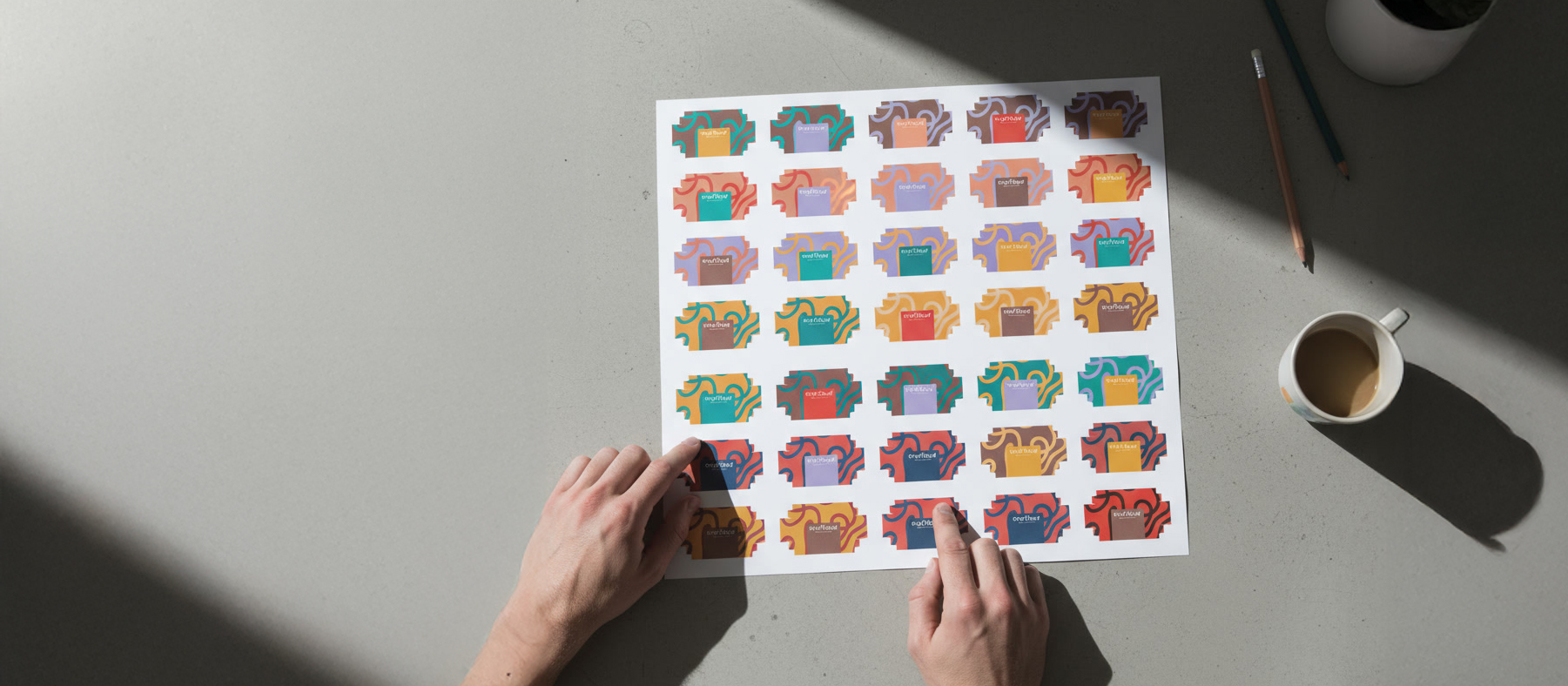
The CraftBud logo pairs friendly, rounded lettering with a functional “cb” mark to create a modern identity that scales easily across digital and physical platforms. This system uses a bold, adaptable color palette to keep the brand energetic for kids while remaining sophisticated for the retail market.
Packaging Design
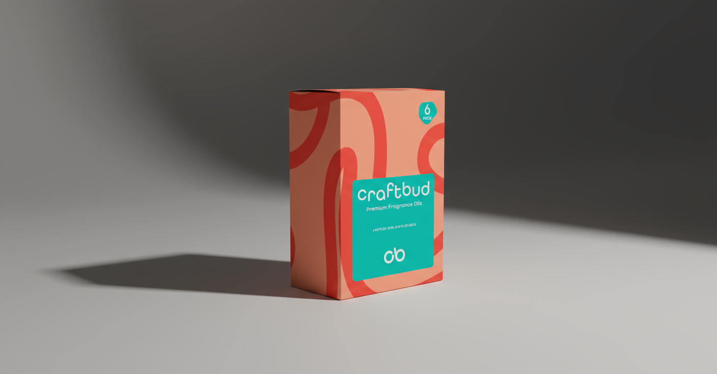
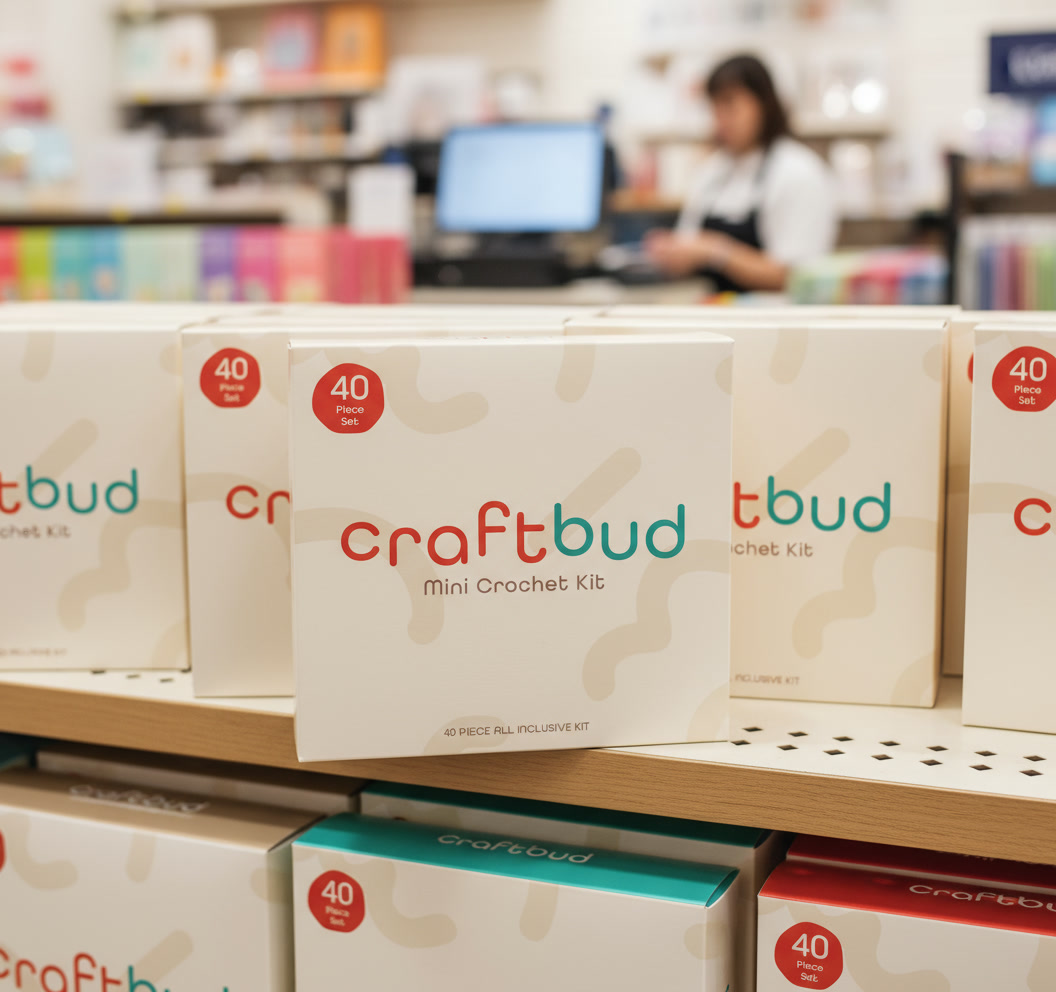
This packaging system utilizes activity-driven patterns and color-coding to differentiate products, creating an engaging and educational experience. Clear visuals and intuitive labeling ensure the kits are easy to identify and use, providing a cohesive look across the entire line.
Implementation
By establishing a foundational brand system and usage guidelines, I enabled the CraftBud team to maintain visual consistency across an expanding product line. The resulting identity provides the shelf impact and clarity needed to cement CraftBud’s position as a creative leader in the DIY space.
